We regularly talk about brand standards here in the Something to Say space (see The Elements of Style and Respect the Logo, just to name a couple). These guidelines are important because they give everyone in your organization a visual “toolbox” that makes your brand easy to recognize.
 Some designers might find brand standards frustrating, especially if they didn’t create them. They might think following the standards means everything has to look exactly the same, or that it restricts their opportunities for creativity in other ways.
This is a short-sighted approach. As we discussed in an earlier pair of articles on limitations, boundaries are one of the best ways to inspire creativity.
But how do you keep a brand consistent while still being dynamic and interesting? Creative designers not only know how good brand standards work, but how to transcend the rules by pushing them. This produces designs that fit (or occasionally stretch) the rules, yet still achieve new levels of creativity.
A LOGO THAT BREAKS THE RULES (SORT OF)
Remember all those special rules we laid down in the Respect the Logo post? There’s a London-based fashion brand called Radley that deliberately ignores most of them. (How dare they??!!) Yet their brand doesn’t suffer. Instead, the way they break the rules makes them distinctive because their design team knows exactly what it’s doing.
 The playful personality of this brand is masterfully captured by its mascot/logo, an iconic Scottie dog with a distinctive outline and a (usually) bright red collar. Unlike most logos, the Radley dog romps through the brand without a lead. He can rotate 360 degrees, flip, bound through busy backgrounds or hop into a basket. He can appear in any color — er…colour — including zebra stripes and glitter. Occasionally he even sports accessories like a purple polka-dotted scarf.

 Radley stands out because it intentionally breaks common rules designed to protect the integrity of the logo. It works because fun and playfulness are integral parts of the brand. In effect, making fun of the standards is the standard.
That said, it’s also worth noting that Radley only breaks some of the rules. They don’t do anything that would damage the brand’s equity, like stretching the logo or using non-standard typefaces.
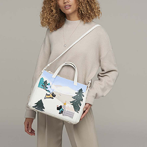
This clever approach also implicitly gives the brand’s customers permission to be as playful as the Radley dog. For example, you can use a scarf in whatever way you want. You can take a giant handbag to a formal gala. This visual strategy suggests you have the freedom to have fun, be lighthearted, and experiment.
DON’T DO TRY THIS AT HOME
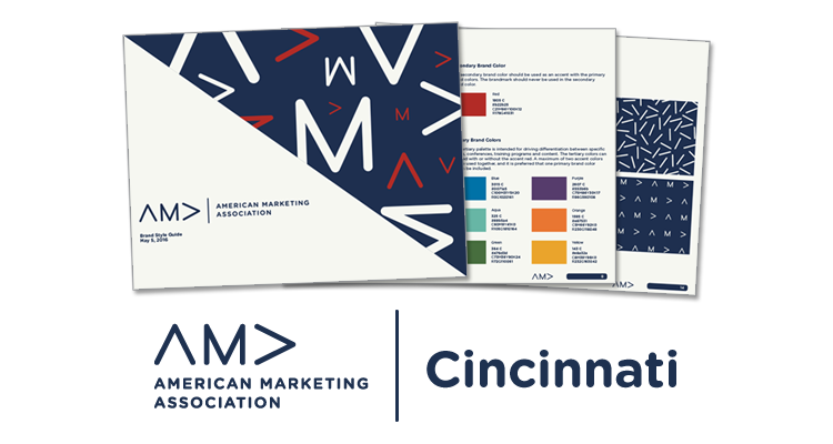
Here’s how you can apply this idea to a more day-to-day example. Not long ago, the American Marketing Association (AMA) issued a new set of brand standards for all of its regional chapters to use. Some of the rules are detailed and explicit, such as typefaces and colors.
 Other guidelines are merely implied. For example, the new AMA logo uses an A without a cross stroke, resembling an upside-down V. The AMA logo starts with this character oriented like an arrow pointing up for the first A, then an M, and finally the same arrow pointing to the right for the second A, suggesting motion or moving forward.
The brand standards also included a couple patterns that played with this arrow shape, sometimes dancing around, sometimes all in a row pointing in the same direction. So there was precedent in for using this logo element on its own, as an arrow, or as part of a pattern. Not as whimsical as the Radley dog, perhaps, but still an element that could be played with.
Not long after these standards were released, the Cincinnati AMA Chapter hosted a conference on user experience called “Ignite!” The brand standards gave very specific instructions on how to present a chapter event, but they only mentioned text — how to typeset the name of the conference and so on.
The local chapter wanted more. They wanted a distinctive look and feel for the event. I agreed, but I also felt strongly that the event should work within the new standards. Two different approaches made this work.
First, I determined that the pattern examples in the brand standards gave us permission to play with the arrow character in other ways. I created logo concepts that combined multiple arrows together in a unit, suggesting ideas like explosions, expansion, flames, and so on. It was simple, elegant, and highly effective.
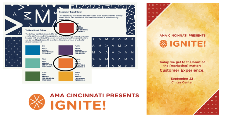 Second, I restricted the event’s palette to the hottest colors from the national brand standards. In this case I was still following the rules to the letter, but with a subtle tweak that helped give the event a unique personality.
A similar approach also worked for the AMA’s annual Pinnacle Awards, which recognize great marketing in Cincinnati. In this case the arrow element was used to suggest mountain peaks.
 In a more recent example, three arrows pointing up at an angle were used to create an icon for the Trailblazer Series. Again the palette was intentionally limited to a green and blue from the AMA standards to keep the design “in the family” while pushing things a bit to give this speaker series its own unique look.


