Have you heard about these things called Brand Standards Guides (or Identity Guidelines, or Style Guides)? Designers love them, of course, because they go deep into all sorts of arcane-sounding graphic design mysteries. But why should you care about all this?
While they can be a little intimidating at first (printed guides for major brands used to fill two-inch thick binders) Brand Guides are really quite ingenious. They document the “look” of your organization’s visual identity, including stuff like:
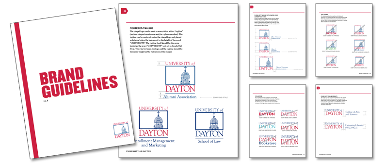
- Your logo — what it looks like, which variations of it are acceptable, how you should use it, and (another designer favorite) what you should never do with it
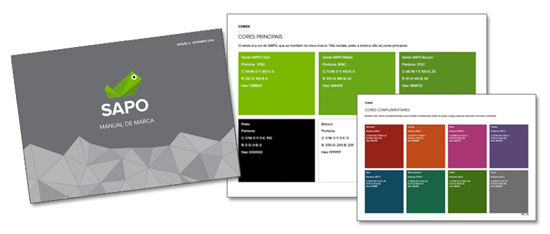
- The colors of your identity
- The types of photos or other imagery that are appropriate

- The typefaces you use, often broken down into styles for headlines and other text

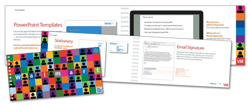
- Examples of how the identity is applied
Why is this important? Consistency.
The point of a visual identity — the logo, the colors, the fonts and everything else — is to make it simple for your chosen audience to recognize and remember you. When this work is done right, every touchpoint with your audience reinforces their appreciation of — and allegiance to — your product, service or mission. If Superman doesn’t put on his primary-colored spandex with his big “S” logo when he saves the day, then he’s just some guy helping out. And the next time the day needs to be saved, you’re like, “Yeah, we should call that one guy. He was helpful. But, who was he? I think he had glasses.”
A Brand Standards Guide is your roadmap for how to use the elements of your visual identity. The most important role it plays is making sure these elements are used consistently and coherently across your entire organization. That way, whether your salesman is handing someone a flyer at an event, or a brochure is sent in the mail, or someone walks into your branch office in Hoboken, every touchpoint with your organization looks like it’s the same organization, and more importantly, feels like it is the same organization.
Ideally, such a guide becomes a way to align an organization. It might document your values or describe the symbolism of the logo. These things may sound trivial, but there are significant benefits when every member of an organization understands and “buys into” the vision behind an identity. The more your internal team acts and communicates in sync with the values of the organization, the more the logo and other elements become meaningful to an external audience.
This is true even if the logo or other visual elements have meanings that aren’t known or shared externally. What matters is that these elements shape the user experience in a positive way. And as I’ve often said before, the user experience is the brand experience.
Keep in mind that design is just one piece of an effective Brand Standard. The process really begins with an internal conversation about what your values and mission are. Coming to an alignment on who you are and what you want your organization to be allows you (and your designer) to shape your visual identity to support those goals.
Another component that needs to reflect your identity is the “voice” of your copy. For more information on what goes in a copy style guide, check out this post by my colleague Tom Tumbusch from WordStreamCopy.
So don’t just throw that Brand Standards Guide on the shelf to gather dust. Share it with your teams at every level, and help them understand its importance. And if you don’t have one, consider talking with an agency or independent designer about creating one. Think about every organization whose brands you recognize and respect. From Apple to Ziploc, successful brands are guided by Brand Standards. Shouldn’t you enjoy the same benefits?


One Comment