Attracting a viewer’s attention to the right place is one of the most important jobs of visual communication. To do this right, it’s important to understand the role of contrast, or the way visual elements in a given piece differ from one another.
Contrast is important because it provides an effective tool for controlling your message. It does this by guiding where you look — your eye is naturally inclined to go where that contrast is strongest. By catching and focusing the viewer’s attention, contrast can give you a way to organize your content and define what’s most important on the page.
Three important ways to use contrast in design are color, light and scale.
1. Contrast in Color
You’ve probably seen an artist’s color wheel at some point. In addition to its hypnotic rainbow effect, it’s a quick way to identify contrasting colors (complements), which appear on opposite sides of the wheel.
But you don’t have to know anything about color theory to be influenced by contrasting colors — the effect is striking whether you understand it or not. For example, in the image shown here, I’m willing to bet the first place you looked was the border between the blue sky and the red rock. That’s because there’s a clear distinction between the two.

photograph by Doug Klocke
While color contrast is a key part of what makes this image distinctive, it could also be used to create a design effect. If type were placed along the edge of the rock border, for example the color contrast would make a visual “path” that would be easy for a viewer to follow — even though it differs from the usual direction American viewers are trained to read (top left to lower right).

photograph by Doug Klocke
2. Contrast in Light
High-contrast images focus the viewer’s attention to well-defined areas of light and shadow. In the image at right, your eye is instantly drawn to the white flower because it’s the brightest element in the image. A moment later you might notice the green plants to the right, or realize that the dark left half of the background is the trunk of a tree, but contrast encourages you to see the flower first.

photograph by Doug Klocke
Like the rock image above, this image’s contrast is strong enough to guide a viewer’s eye in a non-standard way. A column of white or light-colored text, for example, could easily be laid over the dark tree trunk.
The two black and white images shown below illustrate how lighting adjustments can impact the viewer’s experience. The first image looks flat because the contrast is low. Because your eye isn’t drawn to any particular place, it tends to wander over the image and settle in a random place. One viewer might first see the patch of light in the upper left corner, another the tree that’s fallen in the clearing, while a third focuses on the darker tree near the right edge.
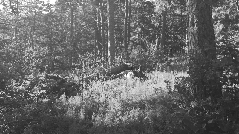
photograph by Doug Klocke
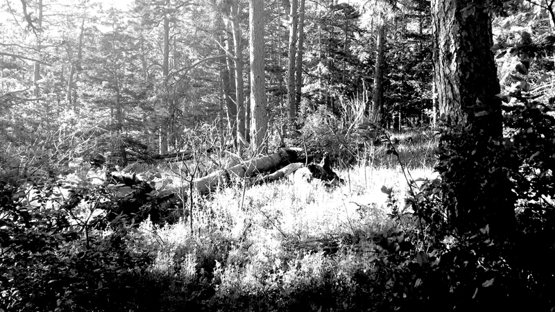
photograph by Doug Klocke
While there’s still a lot of detail competing for your attention in the second version of the image, simply increasing the contrast immediately makes it look more dynamic. You’re more likely to look at the bright clearing near the center first.
3. Contrast in Scale
“Scale” is essentially a designer’s fancy word for “size.” Combining elements of distinctly different sizes is an easy way to create contrast, from showing a tiny human figure standing in a canyon to mixing type sizes in a title or logo.
Contrasting scale is a key part of the CD cover design shown here, where the word “Give” is emphasized by appearing larger than the rest of the title. We even throw in a contrast in typefaces. The title of the album is in a decorative typeface with open spaces, while “BillTonnis” (the artist’s name), appears in a font that is simpler, clearly indicating that it’s a separate element.

Now that you’re an expert on this subject, you’ve probably noticed that the other types of contrast are also being used in this cover. The warm color of the background contrasts with the cool blue of BillTonnis. Light contrast draws your eye to the bright sun first, and the horizon is defined by the line where the bright, smooth horizon meets the darker, rippling water.
None of these choices were accidents. They were made consciously as part of the design process with an understanding of how each type of contrast would affect the result. In this way, you can ensure that contrast works with you to highlight the most important part of your message, engaging your viewers faster and more effectively.


Cool!
Thanks!