Back in February I introduced the concept of “design energy.” We talked about how a skilled designer can make use of different kinds of “energy,” from creating a sense of direction or motion to guiding the viewer’s attention in a particular way — and even to encouraging emotional responses.
At the time I used an architectural example, but the same principles work just as well if you’re designing a logo or page layout. Let’s look at how you can apply them.
One of the first exercises I learned in design school highlights how different elements can work together to become a cohesive unit. You sketch a random squiggle, then start shading in shapes that emerge.
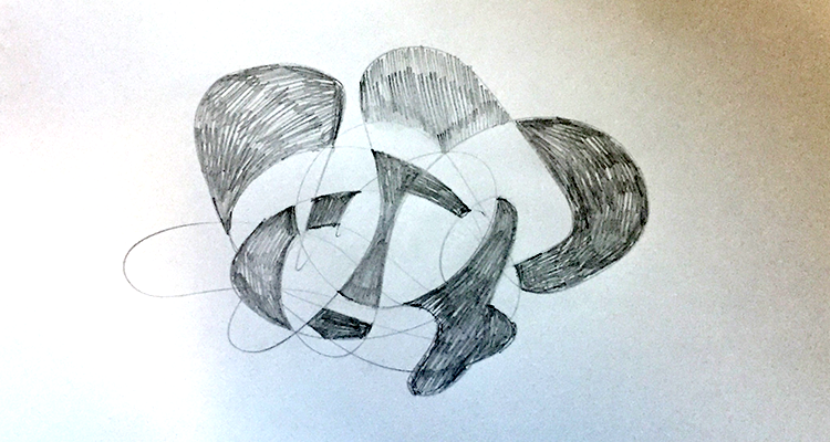
Notice that some of the shapes are pulling the energy outward — which is not helpful. There are also a couple spots with tight connections, which can block the energy or create tension.
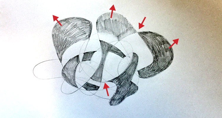
So you start to eliminate some of the shapes, maybe color in a few more, and a more cohesive form begins to emerge. There are still some tight spots, but you start to notice areas of interesting energy.
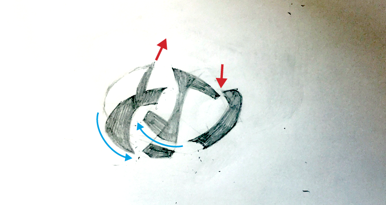
So you eliminate more, and start to manipulate the remaining shapes to emphasize the energy you were starting to see. You start creating a unit, but with some flow in between the shapes that allows the design to breathe and gives it a sense of movement.

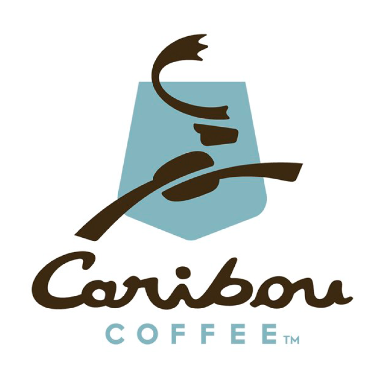
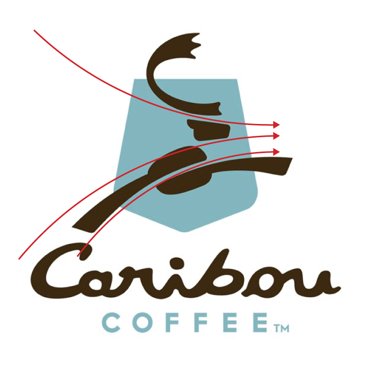
Caribou Coffee offers an excellent example of a design that uses energy effectively. The logo moves you forward, like a good cup of joe should. The energy is focused in one direction. The spaces between the shapes that make up the logo allow the energy to flow through it. Also note how the logo “emerges” from the shape behind it. The overall effect is very active.
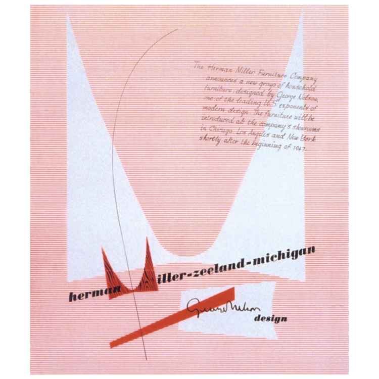
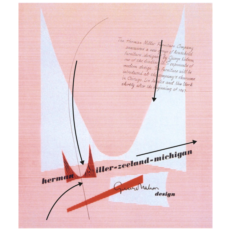
Here’s an example of similar principals being applied to page design. In this vintage Herman Miller ad, graphic elements support the minimal type, effectively leading your eye to the company name and logo. There’s a lot of movement and excitement. It’s like a carnival ride, but like a good roller coaster, the energy moves in just one direction.
Using design energy effectively is part art and part science. But whichever way you look at it, a good designer should always be aware of exactly what the energy is doing.
Why is this important? Because even people who have no design training can sense this “flow.” If the energy is competing with itself, pulling the focus outward, or getting trapped within the design, almost any casual observer will sense that something is wrong – even though they probably won’t be able to tell you what it is.
Get it right, however, and design energy can help encourage the exact response you want from your viewer. (And I promise to use this power only for good…most of the time.)


Very cool, Doug. I’d never seen this exercise. Thanks for the perspective and insight!! (Sorry we missed your Bastille Day and hope you had a blast.)
Thanks, Cindy!