Several months ago, I was half-listening to NPR when I heard: My ears perked up.
 I grew up on Saturday morning cartoons, and — of course — Schoolhouse Rock.
 Bob Dorough, a jazz vocalist and composer, was the man behind many of the songs from Schoolhouse Rock, including, of course…
 Sadly, the reason NPR was playing the song was in memory of Bob Dorough, who had passed away that week. But as I listened to the song…
 I couldn’t help shouting out, “Three IS a magic number!”
Here’s why…
THE VISUAL WIZARDRY OF THREE
In design, the number three is the foundation of many key concepts:
- Placing three elements on a page is a common way to provide balance that’s pleasing to the eye.
- Groups of three can show progression. For example: 1. Main Head, 2. Subhead, 3. Body Copy.
- You generally don’t want more than three fonts or three font sizes on a page. (Yes, I break this rule sometimes, but I know the rule.)
- When you think of things that can go on a page, you’ve got 1. Type, 2. Photos, and 3. Graphic Elements.
- A triangle has the fewest number of sides that a shape can have. Only two sides? All you have are two connected lines.
- Space — as in the world around us — has three dimensions (at least as far as those of us without a degree in quantum physics understand it).
THE RULE OF THIRDS
In photo composition, painting, or graphic layouts, the “Rule of Thirds” is a guideline to help you create pleasing compositions. Here’s how it works:
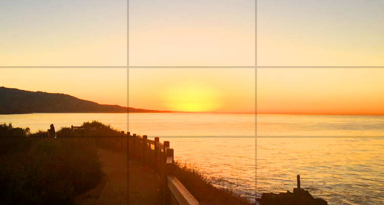
When you look through the viewfinder of your camera, or at the screen on your phone, mentally divide it into thirds horizontally and vertically, so you have 9 sections. Some cameras actually show you these lines. You’ll also see them when you use the cropping tool in Photoshop, on an iPhone, or in other popular image-editing applications.
Once you see or imagine where the lines are, align the subject of the photo — your main focal point — at one of the intersection points. The idea is that this creates more energy and interest than simply centering the subject. Take a look at this example:
LOVE TRIANGLES
You’ll also find the number three all over the place in color theory. For starters, there are three primary colors: red, yellow and blue. And, come to think of it, there are three secondary colors: orange, green and purple (or violet, if you want to get picky). Both primary and secondary colors are examples of “triadic” combinations — which is just a fancy way of saying they’re evenly spaced on the color wheel. But that’s just the tip of a three-pointed iceberg.
 While there are many exceptions, designers frequently use three main colors. In one scheme you start with one color, then select two colors that are adjacent to its complement — it’s called split-complementary. This is a variation on the triadic combinations mentioned above. Contrasts like these can create visual excitement, attract attention, or simply add a bold accent.

 Light waves also have three primary colors: red, green, and blue. While reflective pigments like ink and paint theoretically create black when their primary colors are mixed in equal proportions, the primary colors of projected light combine to create white.
So, three IS a magic number. Three cheers for three! Three! Three!! Three!!!


