Choosing colors for a brand may seem like an easy task. “Oh, let’s make the logo red and yellow.” In reality, there’s a lot more at stake than meets the eye, so it’s not a process to be taken lightly.
This month and next, we’ll talk about where to find inspiration for the “right” colors, and how to evaluate different options for maximum impact.
Why color matters
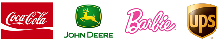
Color is such an integral part of visual design that some companies have trademarked signature combinations, such as Coca-Cola’s red and white or John Deere’s green and yellow. Others have gone further, seeking to “own” unique shades of individual colors — think Barbie pink, the canary yellow of a Post-It note, and UPS’s “Pullman brown.” (Apparently brown did do something for them.)
Why go to all this trouble? Because these established colors have such strong associations with their brands that we can recognize them instantly, even without seeing their logo or tag line.
In addition to making them memorable, these classic color combinations have endured because they also fit the personalities and messages of their brands. Coke’s playful red and white implies that you’re having a good time. John Deere’s combination suggests the colors of a thriving farm in many seasons. UPS brown was inspired by the paper used to wrap parcels. But how to determine which colors are right for you?
(Almost) Everything you need to know about color theory
Artists and designers organize colors into a rainbow circle, or “color wheel,” originally conceived by Sir Isaac Newton in 1666 (and you thought the binder clip was old). The primary hues of red, yellow, and blue are equally spaced around the wheel, with various mixtures placed proportionally in between. Thus green is halfway between yellow and blue, for example, while turquoise is closer to blue than to yellow. Color wheels range from simple pie charts with just a few colors to sophisticated gradients with a nearly infinite selection.

This is a useful tool, because relationships on the wheel quickly indicate which colors work well together. “Harmonious” palettes — that is, color combinations humans find pleasant to look at — fall into three basic categories:
- Analogous — Colors that appear side-by-side on the color wheel. Red, orange, and yellow are a simple example. These colors blend well because of their similarity.
- Complimentary — Colors on opposite sides of the color wheel, such as red and green. This is a classic case of “opposites attracting.” To the human eye, the contrast between complimentary colors makes them look good together.
- Natural — Combinations we’re accustomed to seeing in nature, like brown and green. If the colors you see in a plant or a landscape go together well, they might blend well in your palette too. Nature rarely makes aesthetic mistakes, and with all due respect to Newton, it sometimes pays to “think outside the wheel.”

These relationships matter, because the same colors can look and act differently depending on what they appear next to. Say for example your organization uses only soft, analogous colors from the bluish region of the color wheel. This can suggest consistency or stability is important to you, or that your culture is relatively conservative.
Now throw in a contrasting complimentary color from the other side of the wheel. Even if you only use it sparingly as an accent color, it will quickly jazz things up — suggesting that your organization has a bit more energy running through it.
The language of color
Some colors are more “active” than others. Bright reds and oranges, and to some extent strong shades of yellow or gold, tend to suggest action, excitement, and movement. On the other side of the color wheel, blue, aqua, and purple tones are a little more serene. Colors like green and maroon can go either way, depending on the shade and how they’re used in context.
These are generalizations — look hard enough and you could probably find shades of red that are less active. On the flip side, a bright blue or cyan can look very active, depending on how you use it.
Another common concept is “warm” vs. “cool” colors. Colors on the yellow and red side of the wheel are often characterized as “warm” colors, a category which also includes most shades of brown and tan. Warm colors tend to advance and attract attention. They get in your face and say: “Yeah! Let’s play!” Think about how many times you’ve seen a movie heroine in a red dress while everyone around her wears less vivid colors — which character draws your attention? If your organization wants be “touchy feely” or give an impression of friendliness, warm and inviting colors like these might be a good choice.

Colors on the blue and green side of the wheel, along with grays, are considered “cool.” Visually, cool colors recede or create an impression of calm. They can also seem a bit more cerebral, reserved, and thoughtful. If you’re touting technological expertise or brain power, something on the cool side may be appropriate for your organization. If your organization has a bit more of an edge to it, you might accent a cool palette with neon, metallic, or electric-looking colors. (For more about warm and cool in action, check out my post Paying Attention.)
Elemental impressions can also come into play. I recently designed four logo and color palette concepts for a client. We quickly realized each had a character associated with one of the four classic elements, and started referring to them as “earth,” “water,” “air,” and “fire.” Earthy colors, for example, can imply that your organization is solid or well-grounded. Water might mean “fluid and flexible”, air can be aspirational, while fire tones could convey that you’re active, decisive, or charging ahead.

Now that we’ve reviewed how colors work with each other, and how to talk about color, stay tuned for next month when we’ll talk more about strategic color considerations.


