Back in May, my partner Tom and I traveled to Italy. It was the first trip outside of North America for either of us. It was a fantastic vacation, but I also learned some valuable lessons about design.
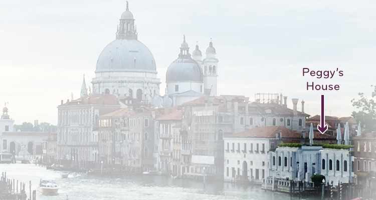
Our first stop was Venice, where — among the many wonderful sites — we visited the Peggy Guggenheim Collection. This museum, the former residence of Peggy Guggenheim, houses her personal collection of 20th century art. She was a patron and friend of great artists like Picasso, Mondrian, Magritte, Pollock — collecting their work as they were just emerging and becoming well established, while encouraging her friends to do the same.
Peggy’s house is an unfinished Venetian palace started in the late 1700s, but the interior is spare and minimalist. The scale of the rooms is cozy. There are a few pieces of furniture, which help to convey the sense that this was indeed a home. (Well, okay, the home of a wealthy heiress. In Venice. On the Grand Canal.) The experience of the artwork is intimate, and it is all around you.
These artists had a profound effect on contemporary graphic design, much like the Cuban-American artist Carmen Herrera who I wrote about in 2016.
The lessons…
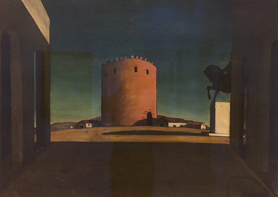
1. Giorgio de Chirico
The Red Tower (1913)
De Chirico’s art charges me. There is something scary, yet entrancing about his compositions of empty spaces. They are so still, so unmoving, and — in this case — so balanced and symmetrical. Yet his work vibrates with tension. There should be people there. Why are there no people??!! What does De Chirico teach me? Emptiness, where you expect to see SOMETHING, can attract attention and draw in your audience.
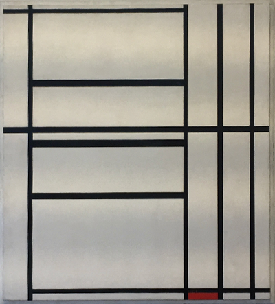
2. Piet Mondrian
Composition No. 1 with Grey and Red 1938 / Composition with Red 1939 (1938–1939)
As a graphic designer, I can’t look at Mondrian’s work and not see grid. I mean, it is grid, and design is built on grid. But this is not equal margins around the edge of a page. Nor are these the equal columns of a newspaper. I find myself noticing the tension where lines are close together. That’s where I see movement. And that movement goes through a contrast of vertical forms and horizontal forms. And that red block at the bottom — did it fall and land there? Is it something pushing in from outside the canvas? Mondrian reminds me to look for opportunities to use an unconventional grid structure that can drive the message of the design in a more engaging way.
3. Alexander Calder
Yellow Moon (1966)
I find Calder’s mobiles delightful. (Cincinnati has one, of course, at our own Cincinnati Art Museum.) The simple forms, floating in space, moving ever so slowly are entrancing. What I find captivating is, though the asymmetrical composition is constantly changing, it remains in balance by definition. Calder’s lesson? Look for opportunities to use asymmetrical, but balanced compositions. Even on a static page, they create movement and interest.
4. René Magritte
Empire of Light (1953-54)
Unlike Di Chirico, where the mystery lies in the emptiness, Magritte seems to give us everything in perfect clarity, until we say, “wait a second,” and stop to think about it. Magritte’s painting style is very realistic, very detailed. At first glance, it almost seems conventional. But the sky is daylight, and the trees, house and street are in almost impenetrable darkness. The house seems to have no door. The first-floor windows are shuttered, but then two upstairs windows are lit. Who is in there? What’s going on?
What do I take from Magritte? That even with the clarity required in marketing and corporate communication, perhaps there is room for mystery, perhaps a little riddle will entice your audience to pause and actually engage with your message.
5. Pablo Picasso
Buste d’homme en tricot rayé (1939)
And then there’s Picasso. What I see in Picasso’s cubism is a deconstruction of perceived reality into discreet pieces. I imagine Picasso picking up each piece, turning them around in his hands, and reconstructing reality in unexpected ways, creating images that are familiar, but confusing — or even disturbing. Picasso’s lesson? When my page layouts are starting to feel the same to me, I need to take apart the pieces. Maybe turn things around or flip them, then see if I can put things back together in a way that may be unusual, but not without cohesiveness — still allowing the essential message to come through.
The lesson of Peggy’s House? Great art — and great design — doesn’t always give you what you expect. By playing with the viewer’s expectations in unexpected and surprising ways, you can create something distinctive that creates interest and engagement. It works even if the viewer doesn’t understand why.


Doug
Enjoyed your read today. I find stepping behind ones story takes me right to sitting beside the person and enjoy seeing a place or thing through their perspective.
Thank you
John
Doug – this is probably now my favorite post of yours. I appreciate how you describe how you look at each artist, and what there is in their work that inspires yours. Very insightful!
A great article, Doug. Great art does have an influence on us, whether we are working with design, other art or whatever. On our recent trip to Spain we visited a Madrid museum with the Picasso original, “Guernica”. I had seen photos and various reproductions of this many times with minimal reaction. Seeing the original bowled me over! Each of these various masterpieces can teach us many things.
This is indeed a good post, it left an impressionism on me. We are nothing, if not learning and experiencing everyday.
Amazing post, Doug! I have art/travel/experience envy–all of these pieces and what you have to say about them are inspiring.
Doug,
Enjoyed the tour. Maybe some day.